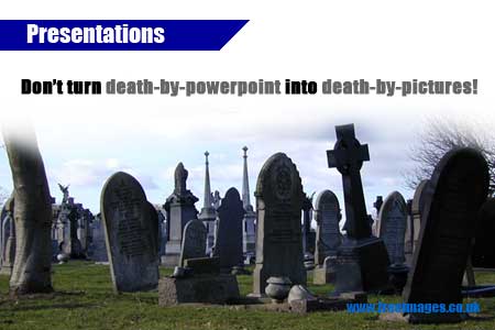
PUT AN END TO DEATH BY POWERPOINT
Compare a magazine advertisement 10 years ago with one today, back then the page was often full of text, usually in a large font. These days there is little text, perhaps just a url. It might be a cliché, but image is everything when trying to get your message across.
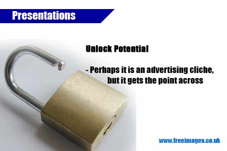
“Emphasize and Punctuate, not Decorate”
Today’s society is tuned to seeing photos and absorbing their meaning. Photos are used everywhere, from breakfast to bed-time we are bombarded by imagery. Today’s presentations and your presentation slides need to meet this modern expectation to get maximum reaction.
I’m not going to tell you about slide presentations and the ‘7 rule’, and ‘kiss’ – keep it simple etc, there are plenty of other tutorials on the net that will do that. Personally I advocate one succinct point per slide backed-up with a diagram, relevant background information, or a list of ‘sub-points’. This article shows you where, when and how to use images for greatest impact response from your audience.
CHOOSE YOUR IMAGE CAREFULLY.. HOW?
There are too many different styles and subjects of presentation to describe exactly which image to choose for a particular audience, but here are a few things to think about when selecting a photo:
Brainstorm a few keywords you want to emphasize on each slide you are illustrating. Avoid emphasizing any kind of pun with an image, that may make a useful distraction mid way thought a long or difficult topic, but the audience will likely remember the joke not the meaning you wanted to convey.
Wake up your audience, stop them from sleeping. We’ve all been to ‘Death-by-PowerPoint’ presentations before now. You don’t find commercials on the TV selling products with bullet points, so why try to get your message across with bullet points?
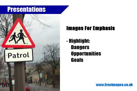
Use images to emote abstract ideas e.g. reliability, leadership, strength, without insulting your audience by telling the in text ‘our products are reliable’ or ‘it will last for years’. Just be careful not to go over the top, don’t use photos just for decoration or they will loose their impact. It's no good just replacing page after page of text with page after page of images. Some ideas are particularly suited to illustration with a photo – selling food is one obvious example, holidays, property are others where the best thing to use is a photo of the actual product. The lack of an image is another vital tool that you can use to allow the audience to breath and add greater strength to slides that do include an image.
People relate well to animal photos, but put them there for a reason; a cheetah emphases speed; an elephant reliability, memory, the long-term; monkeys are jokers not to be relied on – use them when talking about your competitors. Study the images you see in the media and you will soon start to understand the power images have in your presentation.
|


TIP: you can apply the ideas here not just in a slide show presentation but also choosing images for a website, or a flyer etc.
All images used here sourced from this site www.freeimages.co.uk
More Articles and Ideas Like This :
Subscribe to read the latest tips, ideas and articles when they are published.
or check our updates page for the latest news, facebook posts and tweets